The Right Stripes - RIBA Journal
Issue 112.01, January 2005
Text Eleanor Young
Images Nick Kane
Ribbons of iridescent film lend Níall McLaughlin Architects’ Silvertown flats a cachet that belies their budget.
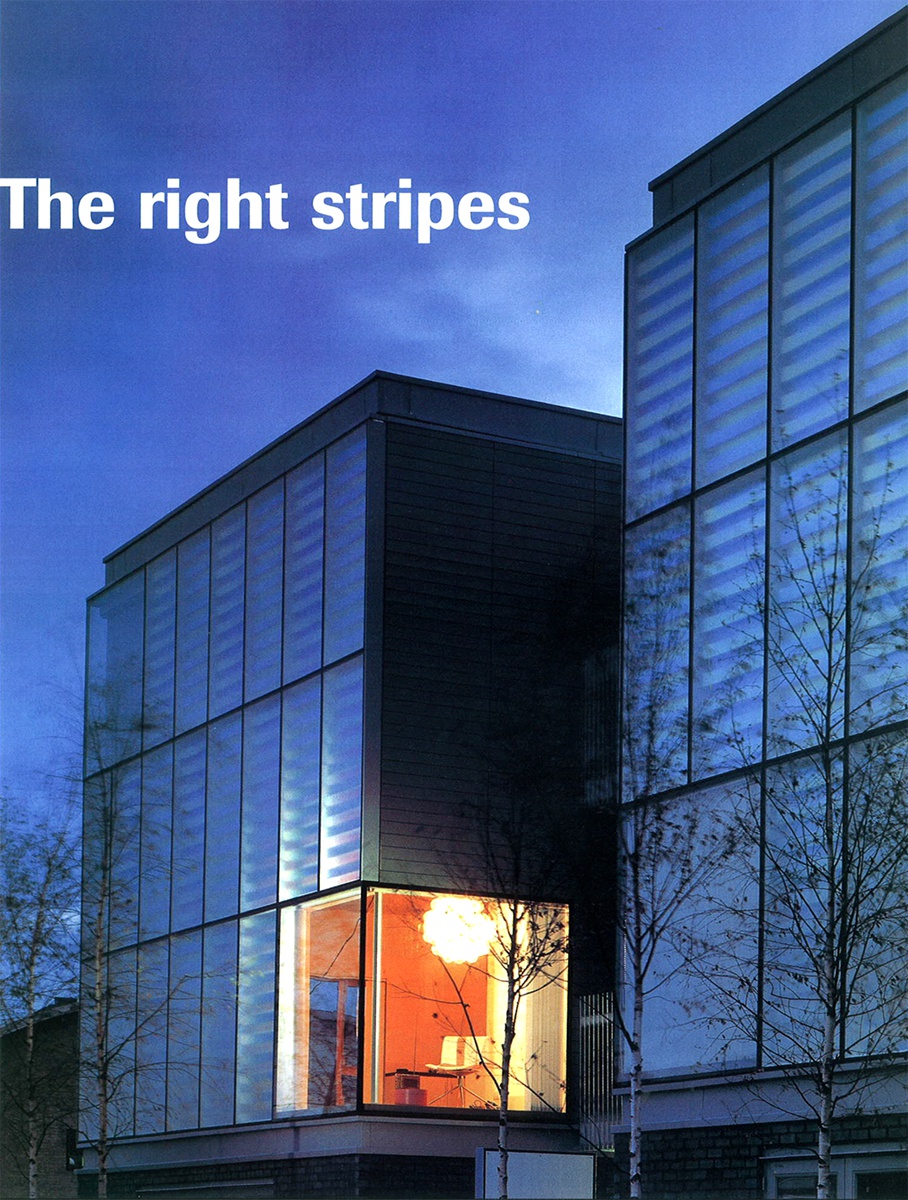
Níall McLaughlin Architects’ shimmering building in London’s Docklands is inspired not just by what is there now but by the area’s past. ‘It is where the riches of the empire were unloaded, and chemically processed into luxuries of dye, sugar and matches,’ McLaughlin explains. He describes the whole building as a ‘chemical flare’, while the 12 flats are conceived as packing crates in a nod to the warehouses that used to stand on the site.
Commissioned by the Peabody Trust, the block stands in contrast to its neighbour, another Peabody project by Ash Sakula. Both are experimental, pushing materials and housing in new directions. Ash Sakula chose to clad its four flats in foil and grp, which gives them a makeshift look. McLaughlin wanted to wrap his three crates in tape and his artist collaborator, Martin Richman, suggested 3M’s Radiant Light Film, an iridescent product used in ribbons, shoes and cosmetics.
Using the film as carefully modulated stripes gives the three-storey ‘crates’ a beauty that simply wrapping them in the material could never have done. The branches of 15 silver birches planted along the front play on the delicacy of the facade, which is firmly grounded by the dark plinth and stairtowers of charcoal brick slips.
So how do the rainbow colours work inside? They don’t – the light does not penetrate to the interior. The timber frame works as normal with its layers of studwork, OSB and breather membrane. The cladding units, shipped ready made from Dublin, act as a rainscreen. Each unit has cast glass as the front layer and a back layer of aluminium. Between the two, strips of film are positioned on slats of glass, set alternately forward or back from the outer pane. This alternation means the slats reflect different spectrums, and in the interplay of light between film and aluminium, McLaughlin has achieved an extraordinary effect.
The flats are essentially square. Living spaces face the street and there are two large bedrooms at the rear. Bathrooms and kitchens are grouped at the centre of the units. But the standard plan doesn’t reflect the variety of the flats. The feel of each large (32m2) open plan living, kitchen and dining room totally depends on the setting out of its huge picture windows – ‘We bundled all the window allocation into one,’ says McLaughlin. In the ground floor flats the windows run along the front, on the first floor they wrap a corner facing the street, and on the third storey the big corner windows look out towards the towers of Canary Wharf. The height changes too. The windows stretch up into the ceiling on the top floor, and down to the ground on the first. There is a certain deception in this: the facade’s four sections hide only three floors, concealing the fact that the ceiling heights put the building on a different scale from its neighbours.
High ceilings and spacious living rooms make the corridors seem all the narrower and darker. Where he can McLaughlin has tried to ameliorate the effect: the top floor flats have a large rooflight that transforms the hall and feeds light into the corridor.
It is interesting to compare the layouts with those of Ash Sakula’s neighbouring flats, which have the same floor area (about 70m2). In these the two key areas are the hall and the kitchen, both larger than usual. The differing approaches throw up questions about how deterministic architects should be. Open plan space is often more highly valued because it suggests luxury and freedom – after all, this is the format of the urban loft.
But the resident has to know how to use the space, and have the funds to furnish it; the furniture – preferably large pieces – has to define the space and make it work. Separation of spaces can offer great flexibility. The blank canvas of McLaughlin’s flats spells out new build while Ash Sakula has given its flats a character often associated with older houses. However, it seems likely that McLaughlin’s flats will attract a more mainstream set of consumers – they look more expensive, although they are the same price (from £210,000, shared ownership) and are more conventional in plan.
All the flats have some outdoor space. On the ground floor french windows open on to a strip at the front protected by planters and the silver birch. At the back there are small paved yards. On the floors above, the flats have a door leading off the living room to balconies that hang off the front of the stair blocks. Two staircases each serve six flats and are wide enough for neighbours to stop for a chat. The introduction of a solid ply balustrade lifts the very plain space, although the details are a little odd, with extra shot blasted steel handrails over the front of the ply.
Occasional anomalies of this sort are scattered throughout. That is to be expected on a design and build project. For McLaughlin this form of contract has been a learning process – he had to step back from the detail. ‘Normally we would want to design everything down to the cutlery,’ he says. But there have been good lessons. He looks at the kitchen with satisfaction: ‘It is from standard kitchen store and 100 times cheaper than one we have just designed.’ The energy of the building is in the facade and here everyone pulled together: the contractor protected the big architectural idea while making cuts elsewhere; Richman refined the layout; facade consultants Dewhurst Macfarlane arranged accelerated testing on the film and ensured it would meet insurers’ requirements. It demonstrates the problems of specifying non-standard construction materials but also proves their value. McLaughlin says when the iridescent tape was brought into the office, the first question was ‘Is it too tacky?’. The answer is no. The film delivers a very special facade, imbued with glamour, allure, movement and depth.