Encounters with Waterhouse
October 2018
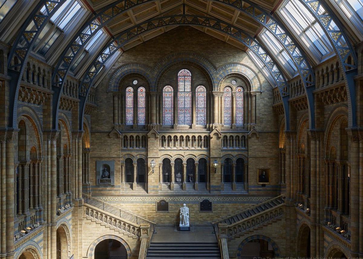
When reflecting on our work as a practice, it is possible to find connecting threads, ideas, references and people who have been an inspiration to us. One of these people is Alfred Waterhouse (1830-1905). Our work for the Natural History Museum has given us a chance to learn more about the great Victorian architect and perhaps by happenstance, we continually meet him again and again through different projects.
Alfred Waterhouse was immensely prolific. He was born in Liverpool to wealthy Quaker parents and spent much of his youth travelling and studying throughout Europe. Upon his return to England, Waterhouse set up his own architectural practice in Manchester, where his Gothic designs won competitions for the Assize Courts (1859) and the Town Hall (1868). His reputation as a practical man, a master of rational planning and his reliability in executing designs, led to commissions for work of a varied character. Eventually he would have around 650 ecclesiastical, commercial, domes- tic and institutional buildings to his name.
In the spirit of High Victorian Gothic, Waterhouse was interested in experimentation, contemporary construction methods and architectural honesty through the expression of structure. Gothic Revivalism allowed architects to test their ideas and bring their vision to life by capitalising on new technologies of the time, and as such, Waterhouse’s interest in utilising new materials and techniques is expressed in the use of the great steel spans of the Natural History Museum’s Hintze Hall. Waterhouse is also known for his careful attention to durable urban materials for the industrial city, such as richly ornamented terracotta and faience, which he used both internally and externally. In our time working with the museum, we have deeply reflected on Waterhouse’s drawings for NHM which portray his predilection for simple bold ornamentation, a delight in the texture and subtle colours of terracotta, and a Victorian reverence for the craftsman.
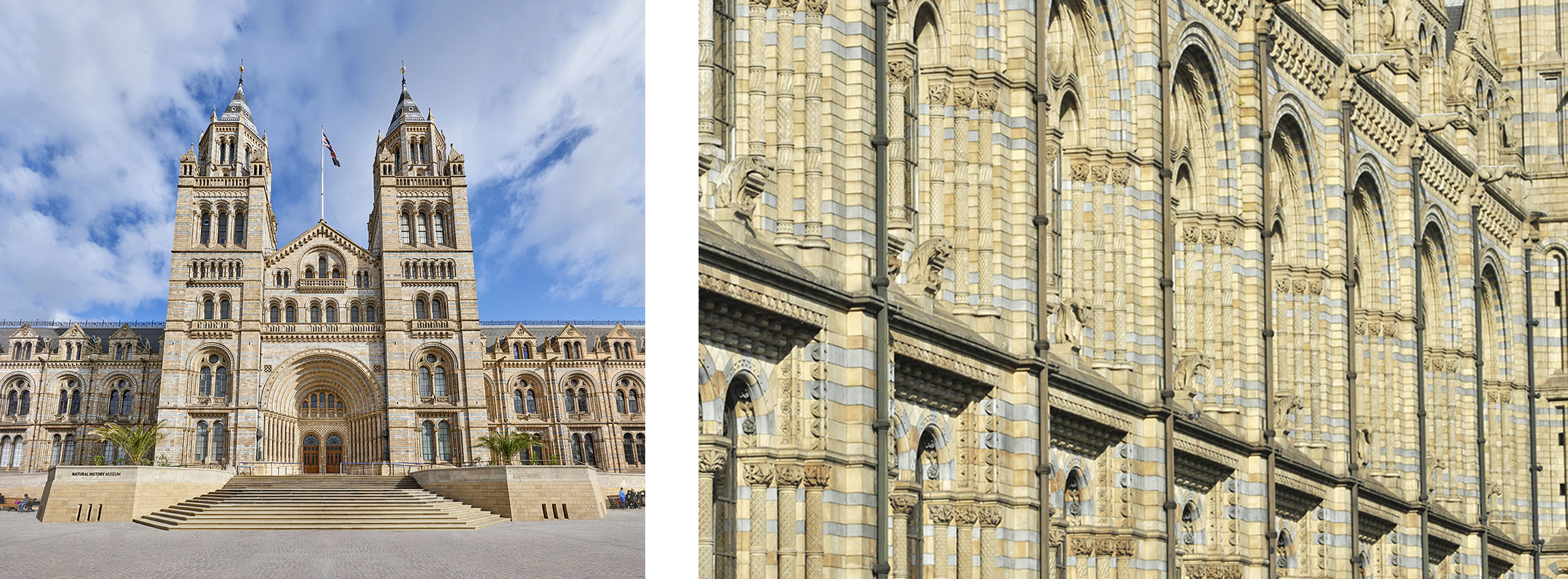
Left to Right – New entrance to NHM Waterhouse building, ornamented terracotta facade detail
Waterhouse is often mentioned for his use of deep red brick, which was brought to London from the North through King’s Cross. Red became the dominant colour of the period in the area and signified the link to the North. For the T1/Tapestry Building in King’s Cross, we analysed the Prudential Assurance Company headquarters in Holborn, completed in stages between 1877-1897, not only for its colour, but also for civic qualities and robustness. The history of the site and the PAC building were a part of the collection of references for the colour-saturated character of the precast panels, reminiscent of Victorian terracotta. We took advantage of available technology when working with decorative pattern and applied it in a structured fashion to all of the precast elements. The pattern was created digitally in three-dimensions and the information was used to direct an automated routing process. This generated a positive panel in soft board, which, in turn, was used to make latex moulds used in the formwork to make a positive precast surface.
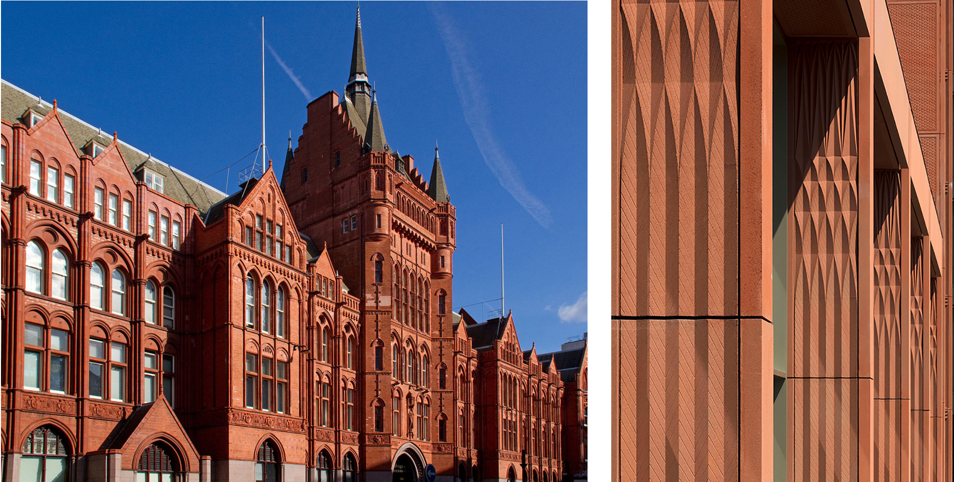
Left to Right – Prudential Assurance Building in Holborn, T1 Tapestry detail
In our projects for Oxbridge colleges we have often had the pleasure of having a Waterhouse building as a neighbour. He was prolific Oxford and Cambridge in the 1860s and 1870s where he built more than most of his contemporaries. Waterhouse’s first university work was the Cambridge Union in 1866, followed in rapid succession of new buildings for Balliol, Caius Tree Court, a new block for Jesus, a series of commissions for Pembroke College, a small wing for Trinity Hall and finally the new women’s college at Girton. It has been key to the success and joy of our projects in these cities to understand the rich historical and material conglomerations of the surrounding buildings. It informs our approach and helps us to weave the projects into the grain of the city. The new song school in Avery Court in Trinity College, Cambridge is sited so that one axis of its cruciform plan aligns with the arched opening leading through the Waterhouse building to Trinity Lane. The proportions of the lantern windows are inspired by the Gothic, and the brick for the Balliol College project was chosen to compliment the Waterhouse buildings along Broad Street and the surrounding buildings. We admire Waterhouse’s bold picturesque compositions and celebration of vertical movement that provides punctuation along the routes around the building. Such visual markers can be seen, for example, in our Somerville and Jesus College projects. We feel privileged to be presented with similar challenges and questions to Waterhouse – what is a contemporary and sensitive response to designing a new building within the existing architectural assemblages?
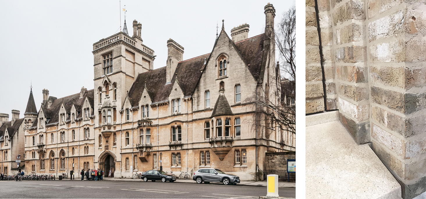
Left to Right – Waterhouse’s Balliol College Broad Street Frontage, NMLA Balliol College project window detail
By way of our continuing collaboration with the NHM, we constantly find ourselves in dialogue with Alfred Waterhouse through his buildings and the ideas contained within them. Studying his extensive body of work and the complexity contained within, is a fascinating prospect, as we’re learning more about ourselves as contemporary practitioners engaging with similar questions.
